

April 2017
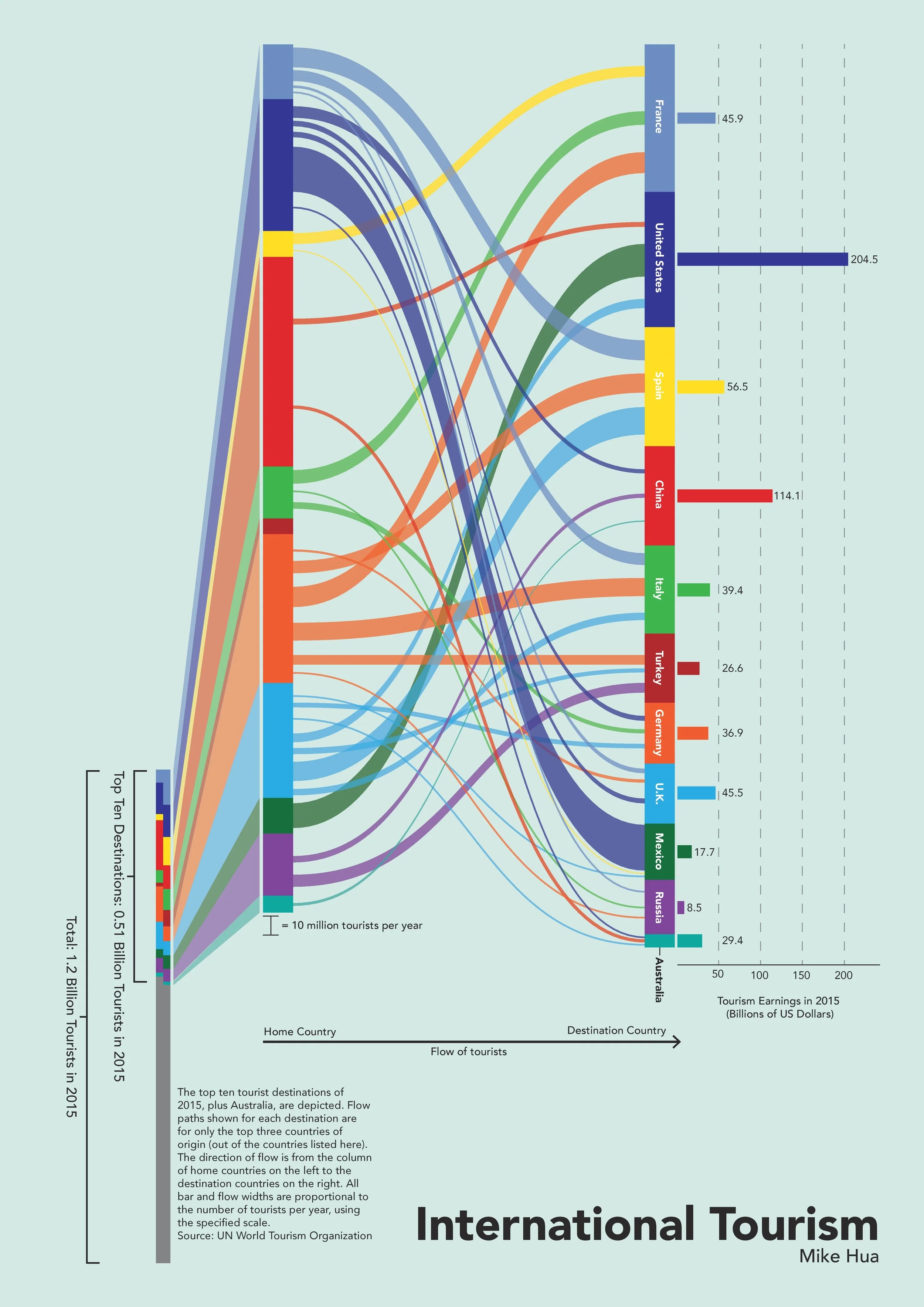
For an assignment in an introductory graphic design class I created an infographic poster that details the flow of international tourists into the top 10 tourist countries.
Flow paths shown for each destination are for only the top three countries of origin (out of the countries listed here). The direction of flow is from the column of home countries on the left to the destination countries on the right. All bar and flow widths are proportional to the number of tourists per year, using the specified scale.
The bar graphs on the right show the destination’s tourism earnings in 2015 in billions of US dollars.
Detail of the small bar on the bottom left of the poster, showing the top 10 countries’ arrivals and departures as a proportion of all countries.